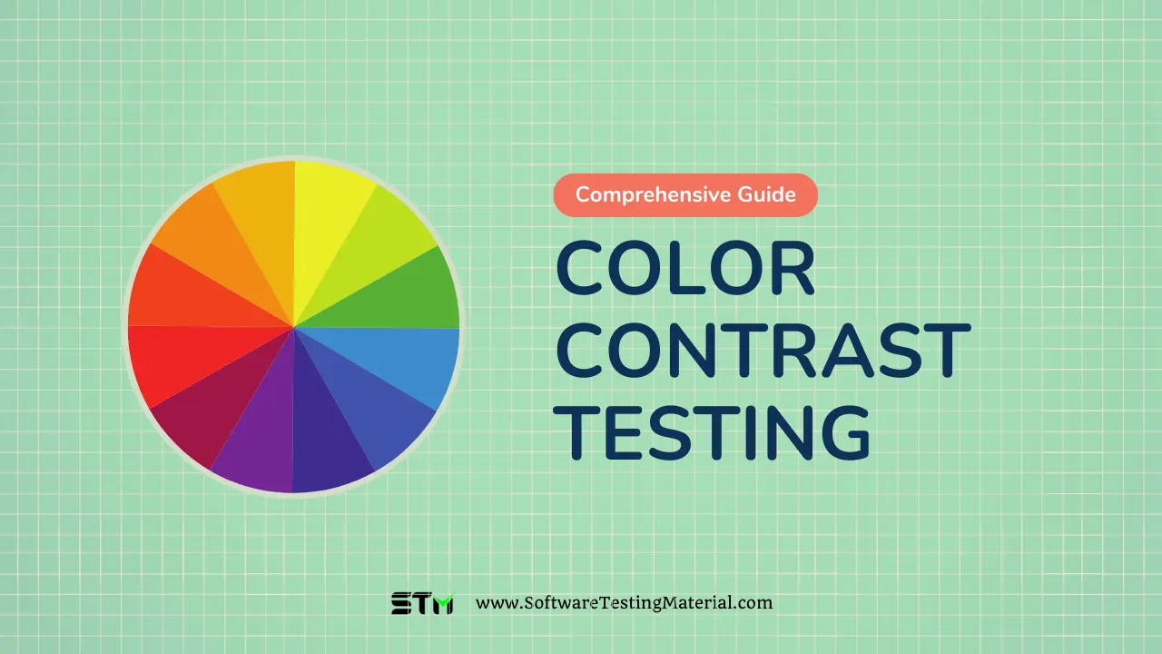
Accessibility Color Contrast Testing: A Complete Guide for 2025
Welcome to our Accessibility Color Contrast Testing Tutorial! In the world of web design, color isn’t just about aesthetics—it’s a crucial element of accessibility. Proper color contrast ensures that text and images are easily visible to all users, including those with visual impairments.
This guide will walk you through the essentials of accessibility color contrast testing, a key component of creating inclusive websites. We’ll explore why color contrast matters, how to test it effectively, and what standards you need to meet.
Whether you’re a seasoned designer or new to web accessibility, this tutorial will equip you with the knowledge and tools to make your digital content visually accessible to everyone. Let’s dive in and learn how to create a more inclusive web through thoughtful color choices and rigorous testing.
Fact: Accessibility testing is crucial in our digital world, where over 1 billion individuals—about 15% of the global population—have disabilities. This includes 2.2 billion individuals with vision impairments and 466 million who experience hearing loss. By prioritizing accessibility, we can create an inclusive online space that enables everyone to connect, learn, and thrive together!
What is Color Contrast for Accessibility?
Color contrast for accessibility means making sure that text and background colors are different enough for everyone to read easily. This is especially important for people with vision problems, such as color blindness. Good contrast helps all users understand information better and navigate websites or documents with ease.
For example, black text on a white background is high contrast and easy to read, while light grey text on a white background can be hard to see. Ensuring proper color contrast is a key part of making sure everyone can use digital content comfortably.
What is Accessibility Color Contrast Testing?
Accessibility color contrast testing is a way to check if the colors used in text and backgrounds are easy to read for everyone. This testing helps designers and developers ensure that the contrast between text and background colors meets certain standards.
By doing this, they can identify any combinations that are too similar in color and make adjustments to improve readability. This is important because good color contrast helps people with vision issues and everyone else understand the information better. Tools are available online that can help test color contrast and suggest changes to make things clearer.
How to Test Color Contrast for Accessibility
To test color contrast for accessibility, you can follow these simple steps:
- Choose Your Colors: First, identify the foreground (text) and background colors you want to test.
- Use Online Tools: There are many free tools available online, like WebAIM’s Contrast Checker or the Color Contrast Analyzer. You can enter your color codes and see if they meet the contrast guidelines.
- Check Against Standards: Make sure your contrast ratio meets the WCAG (Web Content Accessibility Guidelines) standards. A minimum ratio of 4.5:1 is recommended for normal text, while 3:1 is acceptable for larger text.
- Adjust Colors if Needed: If the colors do not meet the standards, try adjusting them until you find a combination that provides better contrast.
- Testing in Real Situations: It’s also helpful to test your color choices in real scenarios by viewing them on different devices and screens. This ensures that your content is accessible to everyone.
By following these steps, you can ensure that your text is easy to read for all users, including those with visual impairments.
Why Do You Need Accessibility Color Contrast Testing?
Accessibility color contrast testing is important because it helps everyone read content easily. When the text color and background color are too similar, people with vision problems may struggle to see them. Good contrast also benefits those without visual impairments by making information clearer. Additionally, many websites and applications need to follow certain guidelines to be accessible to all users. By testing color contrast, you are helping ensure that everyone can access and understand your content, creating a better experience for all.
How Does Accessibility Color Contrast Testing Tool Work?
An accessibility color contrast testing tool works by checking the colors you use on your website or application. When you enter your text and background colors into the tool, it calculates the contrast ratio between them. This ratio shows how easy it is to read the text against the background. The tool compares your contrast ratio to the accepted standards, such as those set by the WCAG, to tell you if your colors are good enough for everyone to see. If the ratio isn’t high enough, the tool may suggest changes to improve the contrast, helping you create a more accessible design for all users.
What Are the Features of Accessibility Color Contrast Testing Tools?
Accessibility color contrast testing tools come with several helpful features to make your design process easier. First, they usually allow you to enter custom colors for your text and background, so you can see how they work together. Many tools offer an instant contrast ratio calculation, showing you if your current colors meet accessibility standards. Some tools may even display a visual representation of the colors, giving you a clear idea of how they look. Additionally, certain tools provide suggestions for alternative color combinations if your current choices do not meet requirements. Lastly, user-friendly interfaces ensure that anyone can use these tools without needing special skills. These features help create content that is readable for everyone, regardless of their visual abilities.
Color Contrast Testing Test Cases
Below are detailed test cases for evaluating color contrast in digital applications:
Test Case 1: Text Contrast Ratio
- Objective: Verify that the text color provides sufficient contrast against the background color.
- Steps:
- Select a piece of text on the webpage.
- Identify the foreground (text) and background colors using a color picker tool.
- Verify that the contrast ratio meets the WCAG guidelines: a minimum of 4.5:1 for normal text and 3:1 for large text.
- Expected Result: The contrast ratio should meet or exceed the specified minimum requirements.
Test Case 2: Link and Text Contrast
- Objective: Ensure that link text contrasts sufficiently with both its background and the regular text.
- Steps:
- Identify a hyperlink in the content.
- Measure the contrast of the link text against the background color and against the surrounding text.
- Use a contrast checker tool to determine the contrast ratios.
- Compare results with WCAG standards.
- Expected Result: Link text should have a contrast ratio of at least 4.5:1 compared to its background and at least 1.5:1 against regular text.
Test Case 3: Hover and Focus States
- Objective: Validate that visual focus indicators and hover states meet contrast requirements.
- Steps:
- Hover over a link or form element to observe the change in color.
- Measure the contrast between the hover/focus color and the background.
- Ensure the contrast remains compliant with WCAG guidelines.
- Expected Result: The hover and focus states must not introduce lower contrast scenarios and should remain compliant.
Test Case 4: Color Blindness Simulation
- Objective: Assess text visibility for users with color blindness.
- Steps:
- Apply color blindness simulation tools (like color filters) to view the webpage.
- Review text for readability and contrast in simulated color-blind states.
- Verify that critical information remains distinguishable.
- Expected Result: No critical text or information should be obscured under color blindness simulations.
Test Case 5: Background Images and Text Overlay
- Objective: Test text displayed on images or patterned backgrounds for contrast.
- Steps:
- Identify sections where text overlays images.
- Measure the contrast between the text color and the image background using the contrast ratio formula.
- Alter the text shadow or background if the contrast is insufficient.
- Expected Result: Text should maintain readability regardless of the complexity or color of the image background.
These test cases should be integrated into a comprehensive accessibility testing strategy, ensuring that all users can effectively interact with web applications.
Best Color Contrast Testing Tools
When it comes to ensuring accessibility through adequate color contrast, several tools can aid in testing and analysis. Here are a few notable color contrast analyzer tools:
- Color Contrast Analyzer (CCA) – Color Contrast Analyser is an open source color contrast analyser tool. This application provides a comprehensive analysis of color combinations, helping to ensure WCAG 2.1 compliance with accessibility standards.
- WAVE – WAVE (Web Accessibility Evaluation Tool) is an essential resource for developers and designers aiming to enhance website accessibility. It provides visual feedback about the accessibility of web content by injecting icons and indicators directly into the page. This tool identifies areas that need improvement, such as contrast issues, missing alt text, and other accessibility violations, allowing users to rectify problems efficiently.
- Google Lighthouse – Google Lighthouse is a robust automated tool designed for improving the quality of web pages. It offers audits for performance, accessibility, progressive web apps, SEO, and more. Within its accessibility audits, Lighthouse evaluates the color contrast between foreground and background elements, ensuring compliance with accessibility standards. By providing detailed reports and improvement suggestions, Lighthouse empowers developers to create inclusive and user-friendly web experiences.
- axe – axe is a popular accessibility testing tool developed by Deque Systems that integrates seamlessly into developers’ workflows. As both a browser extension and a command-line interface, axe allows users to easily test web pages for accessibility issues, including color contrast violations. Its intuitive interface provides detailed analysis and context-specific guidance on how to fix identified issues, making it a valuable resource for developers aiming to achieve compliance with WCAG standards. By leveraging axe, teams can ensure their web applications are accessible to all users, promoting inclusivity and enhancing overall user experience.
- Applitools – Applitools is a powerful visual testing platform that ensures the quality and accessibility of web applications by focusing on visual validation. It automates the process of comparing visual elements across different browsers and devices, detecting visual bugs that traditional testing methods might overlook. With its AI-driven visual testing capabilities, Applitools can identify discrepancies in layout and appearance, helping developers maintain a consistent user experience. Additionally, Applitools supports accessibility features by allowing teams to verify that critical visual components meet established accessibility standards. By incorporating Applitools into the development workflow, teams can enhance their testing strategies, ensuring that applications are not only functional but also visually appealing and accessible for all users.
Conclusion
As we conclude this Accessibility Color Contrast Testing Tutorial, remember that ensuring proper color contrast is a fundamental step in creating truly accessible websites. We’ve covered the importance of color contrast, the tools and techniques for testing, and the standards you need to meet. By implementing these practices, you’re not just complying with accessibility guidelines—you’re enhancing the user experience for everyone who visits your site.
Color contrast testing may seem like a small detail, but it can make a significant difference in how people perceive and interact with your content. As you move forward with your web projects, make accessibility color contrast testing an integral part of your design process. It’s a simple yet powerful way to demonstrate your commitment to inclusivity and ensure that your message reaches the widest possible audience. Keep testing, keep improving, and together we can create a more accessible digital world for all.